When you’ve added a product to your cart and are ready to buy, some websites make the process gloriously smooth. Your only pause is to wonder, “Did I just board a Caribbean cruise?” Others make you want to jump ship immediately.
So, what’s the difference? What makes for a happy checkout process and, in turn, happy customers?
As it so happens, there are a few things that can make or break that crucial journey from “add to cart” to order confirmation. We recently dug into this when we audited 50 of the NRF’s top retailers’ e-commerce websites (get the full study here). In this post, we’ll look at five of those key elements.
If conversion feels like a struggle and you can’t put a finger on why, a little self-evaluation might help. Read these five online checkout tips for happy customers and see how many you’re following. (Plus, see how many top retailers from our study are following them!)
1. Let Shoppers Check Out as a Guest
You’re cruising along, ready to buy, when you hit a page asking you to log in. Since the average business person has 191 passwords to remember (LastPass), they may as well be asking you to embark upon a quest worthy of a Tolkien novel.
A simple source of relief for many an online shopper is to offer the option to “Checkout as Guest.” No digging around for passwords. No moment of hesitation while I debate whether it’s worth the trouble. Easy.
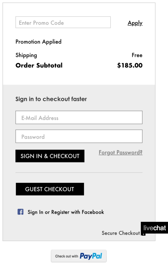
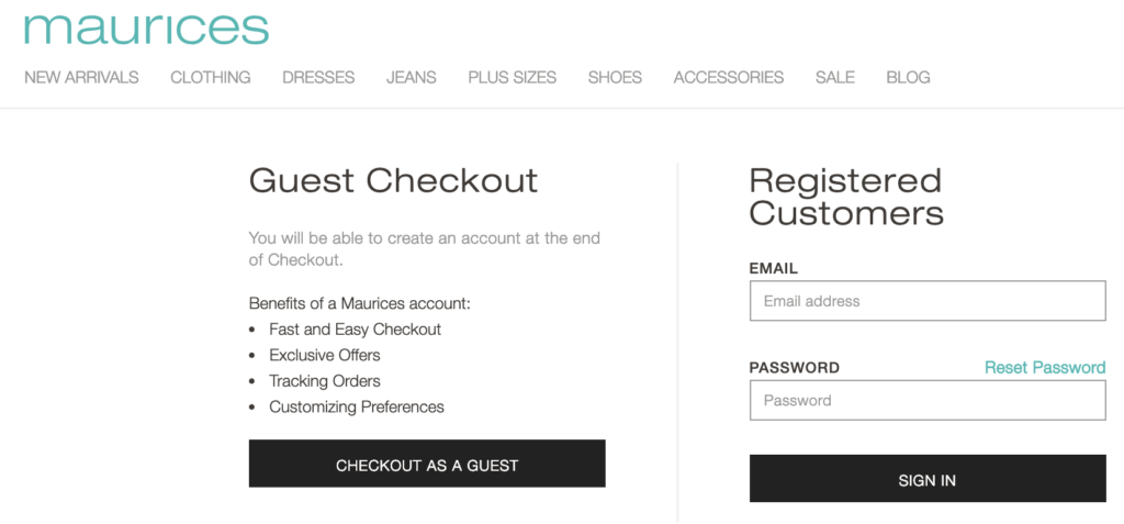
If you are going to encourage shoppers to create an account, explain the benefits of doing so. As a business, you undoubtedly prefer shoppers set up an account. But as shoppers, we ask: what’s in it for me? There could be so many perks we don’t know about! Make sure to tell your shoppers, like Maurices does here:
Don’t stress too much over getting online shoppers to create an account. Dare I say the first buy might be a little early to request this kind of commitment? Digital marketing is about relationship-building, and relationships take time. You can still wow them with your follow-up emails and customer service. (Check out this example that especially impressed NordicClick Partner Mike McAnally).
Audit Results: 40 of the 50 retailers had a guest checkout option, and only 11 of 50 gave reasons to create an account.
2. Condense Checkout Steps to One Page or Use Breadcrumbs
Depending on your e-commerce platform, checkout pages take many forms. The ideal format is a single-page checkout. It’s easy to follow and eliminates a lot of potential for abandonment.
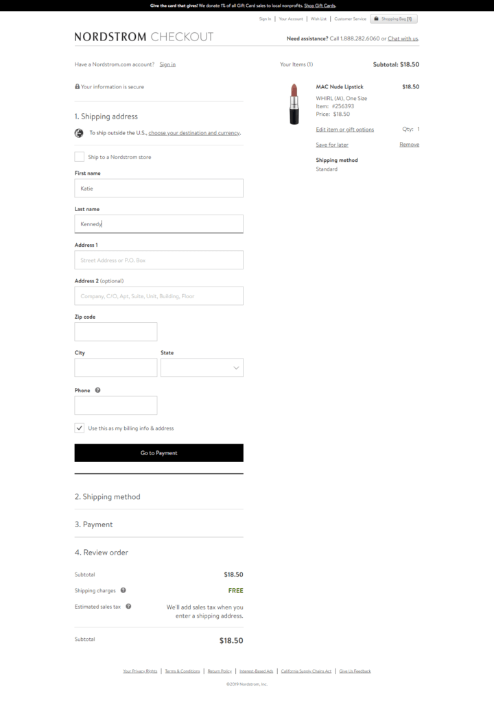
If single-page is not an option, a multi-page checkout with prominent breadcrumbs is your next best bet. A clear sense of where we are and where we are headed puts the mind at ease. It’s not like we’re using Google Maps for the pretty pictures…
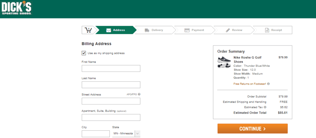
Audit Results: 6 of the 50 retailers used a single-page checkout, while 42 used a multi-page format with breadcrumbs.
3. Provide Clear Shipping Options (Bonus Points If One is Free!)
Amazon’s free two-day shipping for Prime members does make things tough for businesses who can’t afford to match that. But here’s a hot take: it’s not all about free shipping! What the e-commerce giant does well is this: setting and meeting clear expectations. If you can’t offer free shipping, you can at least do that!
Your customers care about different things. Some might be in a time crunch, while some are penny-pinchers. Offering a range of options that meet customers where they’re at means more happy customers and more sales. (As long as you deliver on those promises!)
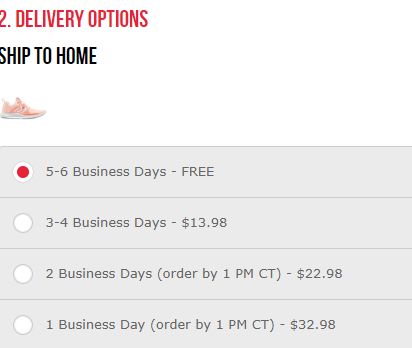
Audit Results: 31 of the 50 retailers provided clear shipping options with associated prices and times. Only 27 of the 50 offered a free shipping option.
4. Show You’re Reliable with Trust Seals
Remember how we have hundreds of passwords filed away somewhere in our brains? As consumers, we’re constantly giving our information away. It’s currency in the digital age. But the frequency with which we give it away doesn’t make it any less scary—especially when it comes to submitting payment details online.
Instill buyer confidence when it counts by adding relevant security seals to payment pages. Here are some common examples:
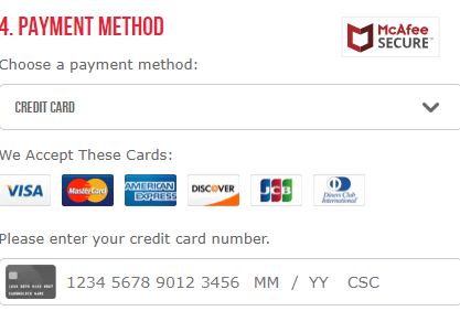
No one wants in on the next data breach. When entering credit card details, seeing trusted names like Norton and McAfee help seal the deal (pun intended). And of course, make sure it all takes place on secure, https pages!
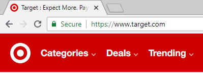
Audit Results: Only 14 of the 50 retailers displayed security trust seals prominently on the payment screen.
5. Offer Multiple Payment Options (Bonus Points for PayPal and Apple Pay!)
Just like with shipping, payment preferences differ from person to person. Smart retailers provide more than one way to pay.
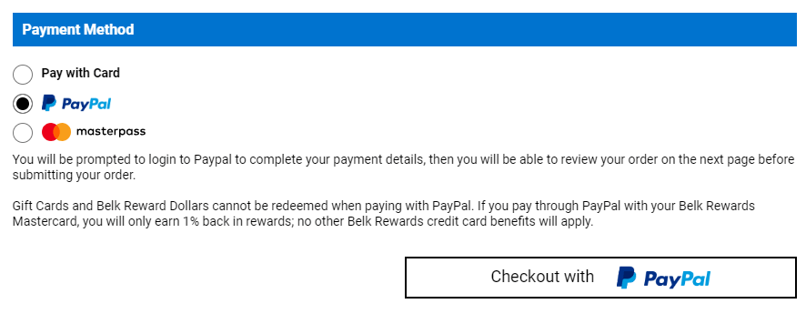
PayPal and Apple Pay are highly trusted payment forms (see #4) and growing in popularity by the minute. The security and ease are unmatched. It’s almost too easy… *sheepishly turns over phone after impulse-buying yoga pants* Offer these if you can, as well as multiple credit card providers and payment by gift card.
Bonus Tip: Speed Matters. Always.
If you’ve ever waited an excruciatingly long time for a website to respond after submitting your credit card details (your cold, hard cash!), raise your hand.

Don’t put that kind of stress on your customers!
The truth is, ticking all five boxes above won’t get you too far if your website is slow. According to Google, most sites lose half their visitors while loading. Those extra seconds of load time give shoppers plenty of time to change their minds, find an alternative, or just get too frustrated to care anymore. Do everything in your power to speed up your site—especially the checkout process.
So when it comes to the checkout process, what have we learned about the way to a customer’s heart?
- Clearly communicate shoppers’ options.
- Simplify steps and orient the shopper.
- Establish trust and security.
- Be quick about it!
What may seem minor to a business can majorly impact e-commerce conversion rates. Follow these tips to win your online traffic over with the best customer experience possible.
Does your e-commerce experience make for happy shoppers? Download the Retail Benchmark Study for more customer acquisition best practices for online retailers.

Looking to take your online retail business to the next level? Take a look at our Ecommerce capabilities.
