What is Google Data Studio?
Data Studio, part of Google’s Analytics 360 Suite and one of Google’s newest products, aims to improve the process of visualizing data and sharing reports. Over the past year since its release, Google has continuously expanded upon Data Studio’s list of data connections and capabilities. Their most notable update as of late was to offer up an unlimited number of reports for all Google Analytics users, versus the original limit of just five per account.
For those of you who are familiar with Google Analytics Custom Dashboards, Data Studio will feel like a breath of fresh air. The tool features similar options in terms of visualizations – think widget-based metric blocks, simple bar charts, and tables – but with significantly more customizations. Data Studio users can bring their data up to brand standard with custom color selections, varied fonts, and the addition of a company logo. In short, if you’re looking to up your reporting game, Data Studio is a great start.
Getting Started with Data Studio
After arriving on Data Studio’s homepage, you may notice it bears a striking resemblance to another Google product – Google Sheets. The tool features those familiar “Owned by Me” or “Shared with Me” tabs, as well as a top menu for creating new reports – which is a relatively quick and simple process. Google guides you through the process of selecting a data source, authorizing your accounts, and choosing the data fields you’d like to bring into your report. Once you’ve added your data, you’re ready to start building your dashboard.
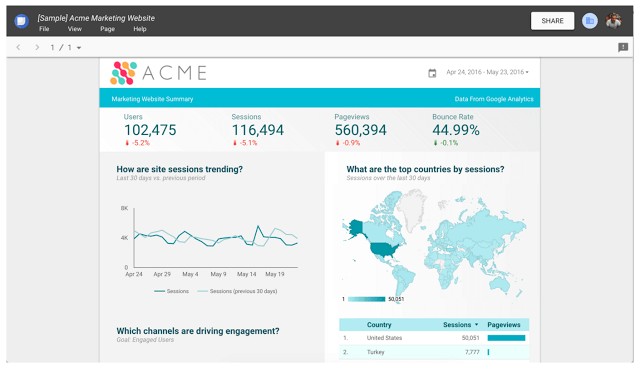
Here’s an example from Google of what a report might look like in Data Studio:
Drag and drop style reports allow for a quick build. To create a new chart, just select an icon in the top menu, click where you want the chart to go and drag the bottom right corner to set the size. A menu will appear on the right side of the page with options for formatting, changing metrics and dimensions, and adding filters. Once you’ve got the hang of this, you can add more charts, copy existing ones, and begin customizing your dashboard.
Maximizing Your Reports
Google’s continued focus on improving Data Studio has led to more and more ways to improve your reports. With the recent updates of new filtering and segment options, as well as the “File Upload” data connector, Data Studio now rivals many other tools on the market. Read on for our top tips for maximizing all of the features:
- Bring in Bing, Facebook, and other ad spend. The Google Sheets and File Upload data connectors make it easy to bring in all ad spend, so you can prove the overall value of your paid media. Yes, this does require some extra effort, but the data is worth it!
- Bring in your CRM data. This can be done through a simple file upload or, if possible, through one of the SQL data connectors. Pairing this data side-by-side with your AdWords or website traffic data can add further insight into overall performance.
- Brand your reports. With fully customizable color selections and a decent list of available fonts, there’s really no excuse for non-branded reports.
- Automate exports to Google Sheets. There are plenty of Google Sheets add-ons and other tools that simplify the process of data gathering. Leveraging these tools when possible will speed up reporting, so you can spend more time actually analyzing.
Over the past year, Data Studio has been adapting quickly to meet the growing demand for robust reporting, and we have a feeling that more updates are just around the corner. With that in mind, we might also expect usage of Google Custom Dashboards to slowly decline. As we begin to see this shift, we recommend starting your transition to Data Studio. Try your hand at a report or two, and test some of our tips above. You’ll be whipping out awesome reports in no time!
![]()
Need help reporting on digital campaign performance? Check out our Analytics and Measurement capabilities.