In simplest terms, eCommerce success boils down to two core components:
- Driving qualified traffic
- Converting said qualified traffic
As any retailer will tell you, the shift to mobile has significantly altered both the inbound strategies and site experience optimizations needed to continue driving incremental growth.
The consumer journey is no longer three, eight, or even twelve touchpoints. It’s now measured in interactions, which can easily range into hundreds, across platforms, channels, and devices. This adventure into a mobile-first world is an exciting development and the most profound shift retailers and marketers alike have ever seen… Never before have we had the ability to directly reach our prospects while they’re waiting in line at the post office, stuck in traffic, entering our store, or even walking a particular aisle!
For example, consumers are using their phones more often than ever. According to Google research, “Over two-thirds of smartphone users (68%) say they check their phone within 15 minutes of waking up in the morning, and 30% admit they actually get anxious when they don’t have their phone on them. In many countries, including the U.S., more searches take place on mobile devices than on computers.”
Additionally, according to a recent Google survey, 70% of smartphone owners who bought something in a store first turned to their devices for information relevant to that purchase. 92% of those who searched on their phone made a related purchase. And finally, 82% of users say they consult their phones on purchases they’re about to make in a store.
Bottom line: thanks to mobile, the opportunity to influence prospects has never been greater. Now, how do we do it?
Whether it’s checking prices or item availability, it’s clear that mobile is most often the first interaction prospects have with your brand. To capitalize on this shift, here are best practices to help you move the needle in mobile.
Show Up: Organic and Paid Search Visibility
Obvious, right? Sure, you may have a mobile site, but is it optimized to the same degree as your main site? Whether you currently have an mDot or responsive site, here are some high-level considerations to ensure your site is visible in mobile search.
Visibility Considerations:
- Is meta data optimized across all pages for SEO (specifically for mDot sites which are managed independently)?
- Are PPC ads showing in position 2 or higher? (On mobile, only two ads display above the fold.)
- Are images optimized for mobile to minimize load time?
- Is site speed acceptable and meeting search engine requirements?
Experience First: Be Relevant and Useful
When it comes to mobile, every page counts. Having too few or too many pages can lead to poor user experience. It’s a high-stakes balancing act… carefully consider what you ultimately want your users to accomplish and ensure they can do so quickly and easily (hiding everything else that could serve as a distraction). If you don’t, it might not just cost you the sale but the customer altogether.
Experience Considerations:
- Is site structure intuitive and easy to navigate?
- Is content concise and easy-to-read?
- Are device breakpoints set correctly?
- Are <div> elements stacking in a consistent way (e.g. text vertically aligned above image)?
- Are all product selection functions tap-friendly?
Speed Thrills: Help Them Help You
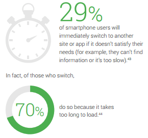
To use an analogy from “The Flash,” your site needs the Speed Force. Nothing kills a potential sale like excessive load time. And, unfortunately, “excessive” is now defined as three seconds or more. Typically on the go, mobile users are looking for instant results. Ensuring they can achieve their goal(s) quickly goes a long way toward ensuring you achieve yours.
Speed Considerations:
- Cut, cut, cut anything that’s not relevant to the end goal (steps, pages, etc.). (Yes, you’ll have to withstand the symphony of rebellion from your designers, but just remind them that no sales mean no paycheck.)
- Be generous to your users and go the extra mile during development to build out one-click functionalities, form-fill assist, and other features to expedite tedious processes along the way.
- May your code be clean and compressed. Third-party integrations, specialty fonts, and excessive styling can all be a drag on your site by adding JavaScript, CSS, and HTML bloat. Be minimalist wherever you can.
While mobile commerce has definitely come into its own and forever changed online retail, an additional component of mobile is also growing. According to Google, “Mobile makes up 88% of ‘near me’ searches, with those mobile searches growing at 146% year over year.” So, whether you’re an omnichannel retailer, convenience store, or restaurant owner, mobile is now imperative to your overall strategy. It’s essential on two key fronts: 1) Driving eCommerce revenue and 2) Driving in-store traffic. Making the investment in mobile performance and visibility can help your business gain an edge on the competition and should be regarded as a vital capital expenditure, not just a marketing expense.
All Google stats and graphics from Micro-Moments: Your Guide to Winning the Shift to Mobile.
Looking to take your online retail business to the next level? Take a look at our Ecommerce capabilities.